Create a test coupon for text on a model
Test lettering at its intended size and orientation before committing a whole model to a font, depth or placement.
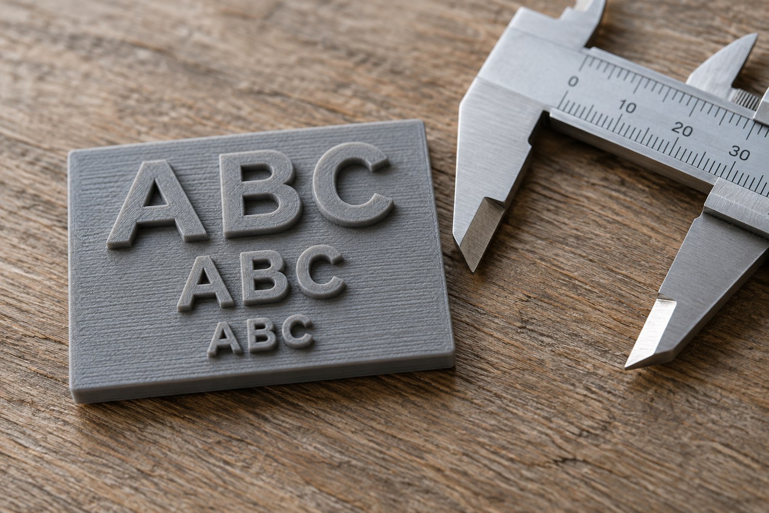
Text that looks clear on a monitor can become hard to read on a small printed object. A test coupon lets you compare a few controlled variations without printing the complete sign, plinth or enclosure. Design the coupon around the actual lettering job rather than a random alphabet sample.
Use the intended word or a short set of characters with similar features. Include narrow gaps, enclosed spaces and any numbers that must remain distinguishable. If a label contains both a one and a capital I, check them together. The aim is readability in context, not simply whether some raised marks appear.
Choose the variables deliberately
Keep the font fixed while comparing size, or keep size fixed while comparing a small number of fonts. Changing every feature at once makes the result difficult to interpret. Use a plain background thickness that resembles the part on which the text will sit. Include the proposed raised or recessed treatment rather than testing a different construction.
Label the variants somewhere that will remain readable, or keep a diagram showing their positions. A coupon with three anonymous versions is less useful once it has been removed from the build plate. Record the font name, character height as defined in your workflow and the depth or relief dimension used in the model.
Match the intended printing situation
Place the lettering in the same general orientation as the finished part. Text on an upright wall is not represented by a flat badge merely because both contain the same letters. Use the relevant machine, material and preparation settings, then inspect the sliced preview for missing strokes or closed spaces before printing.
Evaluate the sample after the same cleanup planned for the final object. If paint will be applied, finish one section and compare it with the unfinished version. Fine recesses may become less distinct after coating. Do not choose the smallest technically visible text if it becomes unreadable at the intended viewing distance.
Try the coupon under ordinary display lighting, not only under a bright desk lamp held close to it. Ask whether the word can be read without already knowing what it says. If a label is decorative rather than essential, a simpler mark or a separate printed paper label may communicate more clearly than very small modelled lettering.
Keep the accepted coupon and its settings note. Reuse the result only when the relevant conditions remain comparable. A new material, orientation or finishing process deserves another check. The coupon records a successful combination; it is not a universal minimum text size for every printer and project.
Another detail to explore
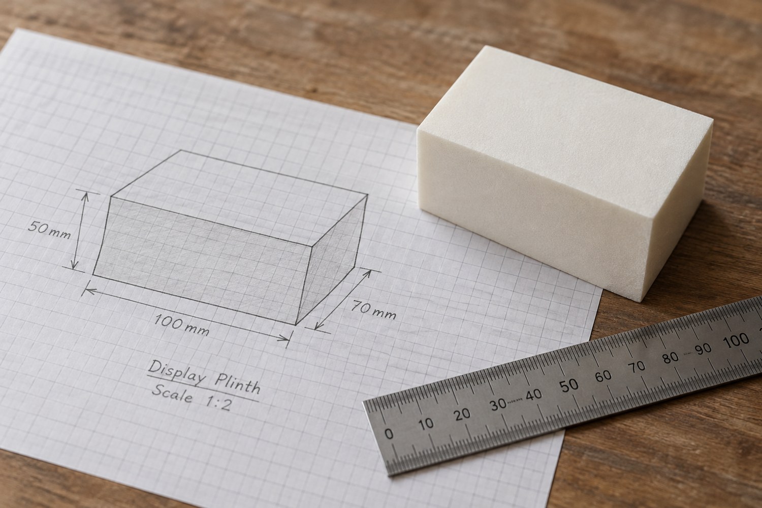
Start a model with dimensions instead of details
Build a short dimensional brief before adding bevels, textures or decorative features. It gives every later modelling decision a reference.
Read article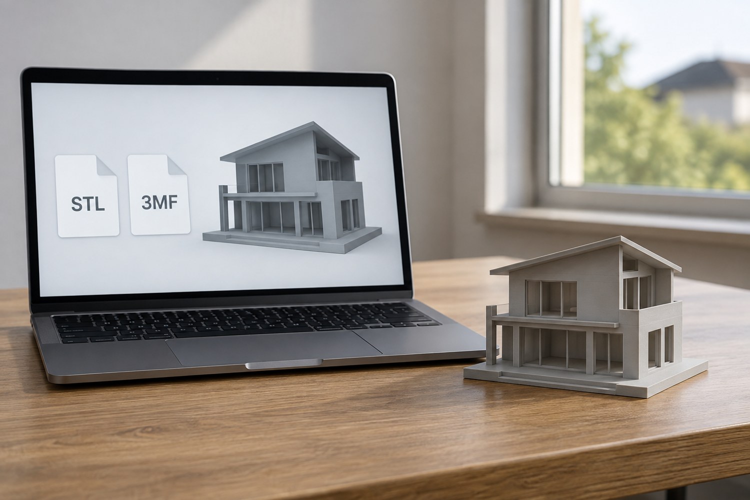
Understand STL and 3MF when sharing a print project
An STL mesh and a saved 3MF project can carry different information. Decide what a recipient needs before choosing the file to send.
Read article